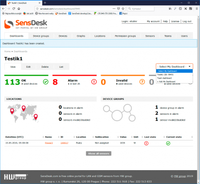
The Dashboard displays information from devices added to the Team. However, it does not necessarily include information about all devices, locations or groups. As explained below, the information to be displayed can be changed by editing the Dashboard.
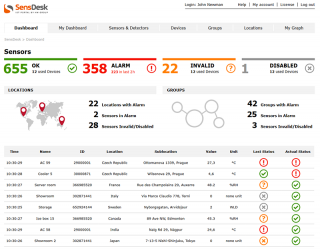
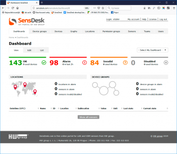
In SensDesk, the Dashboard focuses on the sensor states, not the sensor values or the device status (that is only supplementary information). It consists of three parts. The first part gives a quick sensor state overview, grouped by sensor state and showing the number of sensors in that state. Each state has a specific color and icon; this scheme is applied throughout the SensDesk portal.
| Status | Color | Sensor icon | Device icon |
| OK | Green |  |
 |
| Alarm | Red |  |
 |
| Unknown | Orange |  |
 |
| Invalid | Orange |  |
 |
| Disabled | Gray |  |
 |
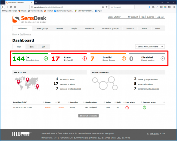 The green color indicates sensors that are in the OK state, that is, they communicate normally and their value is within the allowed “safe range”. A device is OK as long as all of its sensors and detectors are OK. The Dashboard shows how many sensors are OK and on how many devices. The latter piece of information is particularly useful for devices that are turned off (Disabled) or malfunctioning (Invalid) as it allows to distinguish a problem with a sensor from a problem with an entire device. Click the OK block to go to the list of sensors in that state.
Red means Alarm, i.e. the reading of a sensor or a detector is outside of the specified safe range. If a sensor or detector is in the Alarm state, the entire device is in the Alarm state, too. Sensors that do not communicate (are disconnected) are not listed in the Alarm section but rather in the Invalid section, even though alarm notifications are still sent for these sensors. This makes it easier to identify problems. The Dashboard also gives an overview of the number of alarms for the past 2 hours (bottom part of the page), so that there is a quick way to see the recent history of alarms, including those that only lasted a short time. This makes it easier to identify the problem if the user received a notification but the alarm ended before the user had a chance to look at it in SensDesk. Click the Alarm block to see a list of sensors in that state.
The orange color represents sensors in the Invalid state, i.e. sensors that either do not communicate at all (disconnected or destroyed), or are not sending valid data (faulty or damaged). Unlike the Alarm state, the Invalid state does not propagate to the device; a distinction is maintained between the Sensor invalid and the Device invalid states. In particular, Sensor invalid means one or more faulty sensors, while Device invalid means a faulty device. On the other hand, when a device is in the Device invalid state (e.g. due to loss of communication), all its sensors and detectors are also reported as Device invalid, so that it is possible to distinguish sensor faults from device faults. In the Dashboard, the Invalid section lists the number of sensors in the Invalid state, regardless of the cause. The number of devices with such sensors is also shown. Click the Invalid block to see a list of sensors in that state.
The grey section represents Disabled sensors. At the first glance, the number of sensors disabled by the user may not look like an interesting piece of information; however, it is very useful when diagnosing a problem. Sensors and detectors (digital inputs) can be disabled by the user at the Edit Sensor page of the respective sensor, digital input or output. Sensors may be disabled to make the SensDesk overview more concise or to avoid storing unnecessary data. It is also possible to disable (and remove from reports) unused digital inputs, outputs, or for instance counter values. The disabled items are then listed under Disabled so that they are easy to find if needed. In the Dashboard, the Disabled section shows the number of sensors as well as the number of devices with these sensors. Click the Disabled block to see a list of sensors in that state.
The sensor block only displays information about sensors and digital inputs of devices that the user has selected at the Edit Dashboard page.
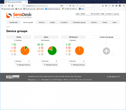
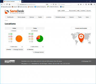
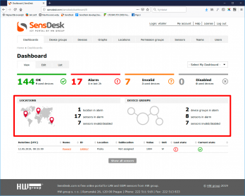 The next important section is the list of Locations and Device groups. This section gives an overview of how many Locations and Device groups are in Alarm, that is, contain at least one sensor in Alarm, how many sensors are affected and how many sensors are Invalid or Disabled. It is a different presentation of the same information as above.
The Locations and Device groups block only displays information about sensors and digital inputs of devices that are assigned to Locations and Device groups selected by the user at the Edit Dashboard page.
The last part of the Dashboard is a list of last sensor state changes (that is, transitions from no alarm to alarm and vice versa, loss of communication, and so on). The table only lists the last state change for each sensor, and by default only in the last 2 hours.
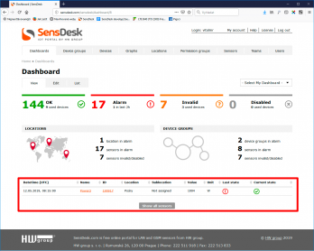 The list always includes the date and time of the state change in UTC (universal time, without regard to the user’s time zone); the name and ID of the sensor, digital input or digital output in question; the Location and Sublocation assigned to the sensor; the current value and its unit of measurement; and the previous and current state. Clicking the sensor name or ID leads to more details about the sensor.
The Current state column displays the current sensor state, while the Last state column displays the previous state. In this way, it is easy to see e.g. that a sensor or a digital input has transitioned from the Alarm state to the OK state or vice versa. It is also possible that both columns show the Alarm state; this can happen, for example, when the sensor was in Alarm because its reading was below the Safe range, and then the reading jumped to a value above the Safe Range.
To display the last sensor state changes regardless of when they have happened, click the Show all sensors link.
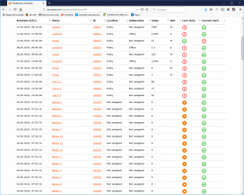 There is one particularity with the list of sensor state changes. Since the table displays state changes, for new devices the state may not be shown or may show as Invalid because there is no record of a state change yet.
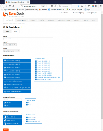
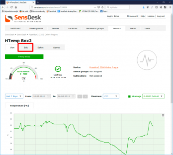
To edit the Dashboard, click the Edit tab under the Dashboard name. The process is the same as if creating a custom dashboard – see below.
What is My Dashboard
My Dashboard is the possibility to create additional dashboards with different contents. While the main Dashboard is the same for the entire Team, individual departments or users can define their own dashboards (i.e. devices to monitor) in order to simplify their view of the monitored environment. This function is particularly useful in large installations where users can define separate views with devices that monitor different sets of equipment in order to see only sensors and devices that they are interested in.
Working with My Dashboard
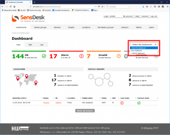 Working with Dashboards in SensDesk is similar to working with Device groups, Locations or My Graph. To work with the Dashboards, use the Dashboards item in the menu. To create Dashboards and switch among them, use the Select My Dashboard drop-down menu in the top right-hand corner of the Dashboard.
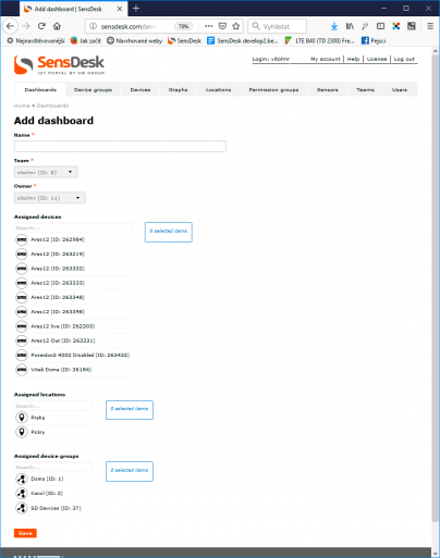
To create a new dashboard, click +Add my Dashboard to open the new dashboard creation menu. Set a name for the new Dashboard and assign devices, locations and groups to it. To select devices, click their names. Selected devices are highlighted in blue and also shown in the pane at the right-hand side. In the same way, selected Locations and Device groups are highlighted.
The sensor block only displays information about sensors and digital inputs of devices that are listed among Assigned devices. Sensors, digital inputs and outputs of devices in the Assigned locations and Assigned device groups are not automatically included in the sensor block.
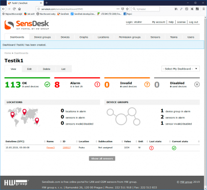
After saving, the Dashboard page is displayed and the data loaded. To switch among Dashboards, use the drop-down menu.
Users of the SensDesk Technology portal can create My Dashboard. If more are needed, users are advised to contact their distributor and agree on the conditions of using extended SensDesk functions, such as increased number of supported devices, extended the datalog length or increased number of custom dashboards or graphs.

